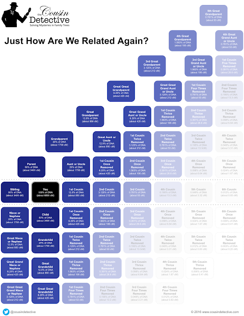
One of the most confusing things about genealogy is when you get into those second cousin once removed situations. Nobody know how that works.
I have seen a number of nice charts, and I've added my own. This one includes a blue shading for just how much DNA you share with the person. I think this really helps show just how much you are related to everyone.
 |
| Genealogical Relationship Tree with shared DNA cM |
I'd like to thank all the others who have done so much more work on both relationship mapping and genetics. Alice J. Ramsay created one of the first relationship charts back in 1987. And if you really want to fully understand DNA and cM sharing, you'll want to read more from Blaine T. Gettinger, The Genetic Genealogist.

Excellent chart! I've linked to this post from my wiki about how to do genealogy research at http://frayedgenes.com/wiki/ so I can refer to it over and over again.
ReplyDeleteCould you possibly share a larger image? It is hard for me to read the text at this size, and image quality is reduced when I enlarge it. I'm excited to learn more, I am awaiting DNA results now.:-) Thank you!!
ReplyDeleteAnne K
You should be able to click on the image to view the full version. I have added a link to the bottom of the page to take you directly to the full version. Download it and zoom in to view as needed.
ReplyDeleteA wonderful chart. Thanks for sharing.
ReplyDeleteWow! Great chart. Thanks
ReplyDelete